Abstract vs. Figurative Representation in Logo Design

CI_d31

In this blog posting, the co-owner of a major branding firm explains that in developing a new corporate identity, graphic designers must strategically choose between abstract or figurative representation to address the design problem.

When a graphic designer sits down to create a symbol for an institution or a company, one of the most basic decisions to take is whether the image should be abstract or should represent something recognizable—a pictogram or even an illustration. One of the great developments of modernism in design—and a development with which our firm has often been associated—is the turn towards abstraction in corporate identity design.

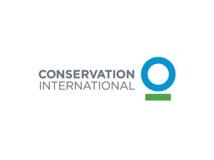
He provides insight into the process that his firm undertook in redesigning the identity for a non-profit called Conservation International which decided to change its mission from “protecting nature for nature’s sake to protecting nature for the well-being of humanity,” thereby making its green silhouetted trees logo inadequate.

Because the organization’s name conveys a fairly accurate indication of its purpose, the design firm advocated a very simple blue circle underscored with a green line to pair with “Conservation International,” thinking, in part, that the new logo would be quickly recognized. Turns out, however, that the designers had to do a hard sell to get buy-in from the non-profit’s executives:

Although the design was made of two simple, basic shapes, their combination and proportions did not look familiar. … Once the mark cleared the worldwide trademark search, we were convinced we had a winner. However, our greatest challenge was still ahead: Having lived with and loved the previous logo, the decision makers found it extremely difficult to accept a simple, abstract form in its place. … We had to make the case that an effective mark can never express everything about an organization. Rather, a trademark is only a small part of an organization’s communications, and its most important task is to be an effective identifier. Finally, we developed a short animated piece for Conservation International, paying homage to the old mark while transforming it into the new design. The sequence started with a monkey sitting in a tree, followed by an expansion of the camera view—suggesting the expansion of the scope of the organization’s work—to other areas of conservation, including humans, and ended with the new trademark. With this animation, we were able to infuse the simple icon with passion, history, and rich meaning. It was, finally, this animation that helped Conservation International begin to transfer their own positive feelings from the old mark to the new.

Staid Bar Graphs Step Aside, Colorful Infographics Are More Memorable

interest4.1 infographic

So what makes graphic visualizations memorable and effective? According to this Fast Company article, doctoral students at Harvard recently finished a project in which they collected more than 2,000 “informative images” from various sources to create the “largest visualization study to date.”

Among other things, the researchers found that study subjects most often remembered “human recognizable objects,” things that people see everyday such as body parts and icons. In addition, they concluded that copious use of color was paramount to memorability:

Color was key; visualizations with more than six colors were much more memorable than those with only a few colors or a black-and-white gradient. Visual density–what some of us might call “clutter”–wasn’t a bad thing either. In fact, images with a lot going on were significantly more memorable than minimalist approaches. Roundness was another hallmark of memorability (after all, our brains do love curves).

Bar charts/graphs were generally not very memorable to people participating in the study because those graphic treatments generally looked too much the same and were difficult to differentiate. The researchers plan to look beyond memorability into visual comprehension in a future study.

Designers Come Out Swinging … Pow! Biff! BAM!!

typefight-1

Type aficianados will have fun at TYPEFIGHT,  a Website where two graphic designers present a typographic treatment of the same character and visitors to the site vote on which one they like better.

TYPEFIGHT is an arena for alphabetic altercations, calligraphic contests, consonant combat, figural fisticuffs, semiotic showdowns, and 210 pt. tussles …

NYC Introduces New “Wayfaring” Signage for Better Navigation by Foot or Transit

walk-nyc-signage-square

New York City launched an initiative this past summer to “provide a clear visual language and graphic standards that can be universally understood, encourage walking and transit usage by offering quality multi-modal information, and provide consistent information across a broad range of environments in the city.”

In this interview with a graphic designer who worked on the WalkNYC program, the interviewer explains that “graphic design can improve the experience, especially when it comes to walkability. As more cities seek to encourage multi-modal transportation—walking, biking, public transit, etc.—the need for good signage to make those activities easier becomes more and more apparent. At its simplest, wayfinding is defined as spatial problem solving—knowing where you are, where you want to go, and the best route to get there. Cartography, or mapmaking, has existed for thousands of years, tracing its roots to cave paintings, but the demands of modern cities and diverse populations call for more than a sign emblazoned with compass rose and a few street names. Today, effective urban maps require layers of information relayed in a clear, consistent, and concise manner so that anyone can quickly assess how to get from point A to point B.” Sounds like good Website design …

Getty Museum Now Offering Images of Artwork in Open Content Program

grioc0004444

Wow, the J. Paul Getty Museum in Los Angeles has just announced that it is making more than 5,000 high-res images of artwork from its research institute available free for downloading:

We hope the Open Content Program will accelerate this democratization process, enabling not only scholars but also students, artists, designers, and anyone who is interested to work with rare materials to produce new artworks, designs, and erudition that extend beyond the confines of the academy and the museum. …  Art institutions, including the Getty, are redefining the relationship between their collections and their publics. Instead of looking at ourselves primarily as the owners of the objects under our safekeeping, we are conceiving of ourselves as stewards engaged in active collaboration and engagement with multiple communities who are discovering myriad new uses for images and documents. It is a very exciting time for art history.

Read more about the program in this blog posting.

New Yorker Magazine Undergoes Welcome Redesign

imagesimages

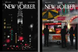
I have subscribed to the New Yorker for many years, in part, to read the essays and film reviews, but even more so to enjoy the cartoons. This brief video featuring the magazine’s creative director explains their process in undertaking a design overhaul that includes a modernized rendering of the Irvin typeface, addition of “emblems” to department headings, use of spot color subheads, and more photography.

Estonian Designers Cook Up Eggquisite Font …

3018301-inline-eggs

This Fast Company article about two whimsical font designers in Estonia—they’ll try making a font with anything—is delightful. They have not only designed a font using fried eggs, they have made others using fried potatoes, whole tomatoes, sliced red onions, and brown sugar cubes. Needless to say, any of these fonts would be fun to use in an informal cooking-related context like signage or menus. And their fearless philosophy should infuse any creative endeavor:

“We’re all surrounded by lots of different things, which can be put into a font. Often we follow our instincts rather than just logic in choosing something,” Logniov explains. “It’s like a man scratching the name of his beloved on some tree never thinks what font he’s using. Same with us. First we make something and only then we look at the result. Sometimes it’s no good, but usually we are happy with the first choice. It has more integrity and the spirit. The quirkiness of our fonts and the raw feel to it is important to us. It has energy.”

Designer Jude Stewart Provides Insights on Color in NPR Interview

9781608196135_custom-3669bdccd504b1827e1c9fbe27f62069e342da26-s2-c85

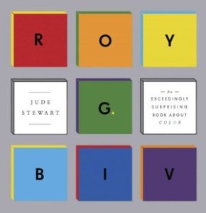
One of the key elements of design we will be studying this semester is the use of color to connect emotionally with a target audience to achieve a desired brand perception and differentiate that brand from the competition, among other things. One important consideration in color selection is considering its cultural or historic connotations, a topic touched on in this September 15, 2013, NPR interview with designer Jude Stewart about her new book titled, “Roy G. Biv” (i.e., red, orange, yellow, green, blue, indigo, violet). For example, Stewart says that it was once the tradition in Catholic parts of Germany to dress little girls in blue to honor the Virgin Mary (though I know Irish Catholics in Kansas City whose parents made them wear blue in the 1950s and 1960s for the same reason). Based on the interview and an excerpt of the book, it looks like an interesting read:

“Red rooms make people working in them more accurate and cautious, and blue turns them more creatively loose—so claims a 2009 study (among others) in the journal Science. (Cognitive psychologists seem to love pitting red against blue and measuring the psychological effects of each.) More than half the world channels their God through blue: Jews contemplating the infinite, embodied through blue-fringed shawls; Muslims in blue mosques; Buddhists fingering turquoise beads as they pray, all thinking blue, blue, more blue.”