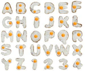
This Fast Company article about two whimsical font designers in Estonia—they’ll try making a font with anything—is delightful. They have not only designed a font using fried eggs, they have made others using fried potatoes, whole tomatoes, sliced red onions, and brown sugar cubes. Needless to say, any of these fonts would be fun to use in an informal cooking-related context like signage or menus. And their fearless philosophy should infuse any creative endeavor:
“We’re all surrounded by lots of different things, which can be put into a font. Often we follow our instincts rather than just logic in choosing something,” Logniov explains. “It’s like a man scratching the name of his beloved on some tree never thinks what font he’s using. Same with us. First we make something and only then we look at the result. Sometimes it’s no good, but usually we are happy with the first choice. It has more integrity and the spirit. The quirkiness of our fonts and the raw feel to it is important to us. It has energy.”

