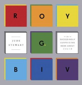
One of the key elements of design we will be studying this semester is the use of color to connect emotionally with a target audience to achieve a desired brand perception and differentiate that brand from the competition, among other things. One important consideration in color selection is considering its cultural or historic connotations, a topic touched on in this September 15, 2013, NPR interview with designer Jude Stewart about her new book titled, “Roy G. Biv” (i.e., red, orange, yellow, green, blue, indigo, violet). For example, Stewart says that it was once the tradition in Catholic parts of Germany to dress little girls in blue to honor the Virgin Mary (though I know Irish Catholics in Kansas City whose parents made them wear blue in the 1950s and 1960s for the same reason). Based on the interview and an excerpt of the book, it looks like an interesting read:
“Red rooms make people working in them more accurate and cautious, and blue turns them more creatively loose—so claims a 2009 study (among others) in the journal Science. (Cognitive psychologists seem to love pitting red against blue and measuring the psychological effects of each.) More than half the world channels their God through blue: Jews contemplating the infinite, embodied through blue-fringed shawls; Muslims in blue mosques; Buddhists fingering turquoise beads as they pray, all thinking blue, blue, more blue.”

